You are using an out of date browser. It may not display this or other websites correctly.
You should upgrade or use an alternative browser.
You should upgrade or use an alternative browser.
kpttnuts-beach
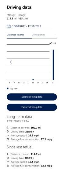
I have since found out by accident, if you click on any column then some more data can pop out to the side and then below the graph you get explanations of what the new coloured bars are. I had already emailed the development team about both questions so it will be interesting to hear what they come back with.
kpttnuts-beach
I posted on a different thread - you need to go onto the website version of the app to finally be able to export the data..just in case someone was following this thread and didn't spot my earlier answer. [I'm new to how the threads work!]
Similar threads
- Replies
- 14
- Views
- 2K
- Replies
- 7
- Views
- 2K

About us
The VW California Club is the worlds largest resource for all owners and enthusiasts of VW California campervans.


