With anything like this lots of ideas, images and mock ups really help.
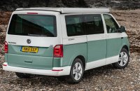
As you can see in your photoshop it does look a little like a sandwich of white and green but at least it looks different from the two tone paint offering from VW that they do.
As you say it does look a bit "bitty" which is exactly what I said in my first post to you. But at least it's individual. This would have been the advantage of wrapping as you could add and change it over time.
Anyway I think you are safer doing the lower in green right to the bottom.
Try photoshopping the wheels on now. I have a feeling those disc wheels will look a bit too retro.
I would go with a more modern spokes wheel with polished spokes and rim. It would balance out the paint.
When I was choosing my rims I photoshopped a few different styles before deciding on the final one. It does help.
Anyway I think we are all looking forward to seeing the end result when it comes.


 ...I'm more towards no white bumpers too - looks better


